skip to main |
skip to sidebar
A quick recap, if one was ever needed - I got to do a cover for online pulp anthology Schlock. In the first post in this series of sorts, I chronicled how the linework was brought about, a post you can read here
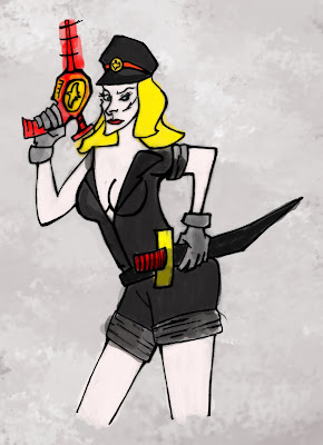 So first off, what I call the quick and dirty colours. This was all done with default Photoshop brushes on a layer over the lines set on 'Multiply'. By playing around with the different brush and opacity settings one can create an interesting texture over which to do some main colours.
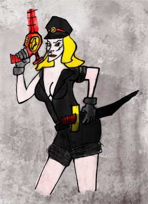 After a bit of refinement, I threw a texture over the colours, basically a layer set on 'Overlay'. The texture in this case comes from a rusted metal column the girlfriend very kindly took a photo of. If you're curious, check out the original photo here.
More playing around with Opacity/brightness settings, and two more textures. One is another photo, this time of an old city wall, which you can check out here. The second is a generic paper texture, taken from Mayang's ultra-useful Texture Library.
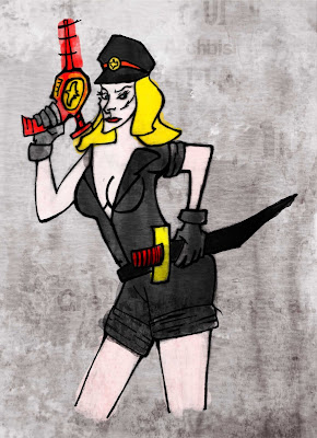
 Discussion with T concluded that we weren't that happy with the colours - yet. So it was time to tweak the colours; first via a bit of desaturation (through the Saturation/Hue/Lightness panel) and then the blues were increased in order to make the background 'colder' and hopefully the figure would pop out a bit more.
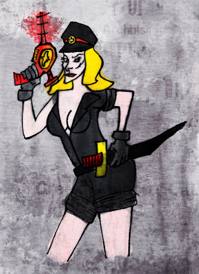
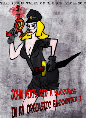 Noisese is generated over the picture (through Filters - Noise - Generate Noise) to give a fine textured effect I tend to quite like. And finally, some excitng sounding (hopefully) magazine text is thrown around in wild abandon. Yes, Schlock issue 2 WILL have a story involving John Keats and a Succubus, so in no way I made that one up. So go check out Schlock for your quality reading needs, and let me know what you think!
At the moment I am doing some artwork, such as covers, for an internet magazine created by a few friends of mine. It's a pulp anthology rightly named Schlock and now it's on its second issue. I did the cover, together with T who did the inks.
The issue's theme is 'Exploitation' so immediately the idea to do something Nazi related came to mind. Nazisploitation, if you will, as in the Ilsa She Wolf of the SS movie series
 .
.
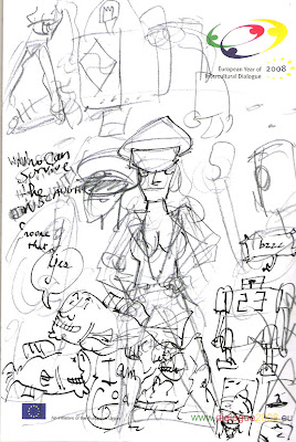
So here is the very first sketch, done on a random piece of notebook pad. The pose was taken directly from this poster to Ilsa Harem Keeper of the Oil Sheiks
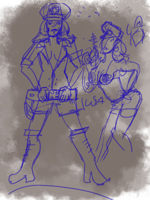
 After that I went to photoshop for more sketching. The sketch on the right striked me as the better pose, so work went on that one.
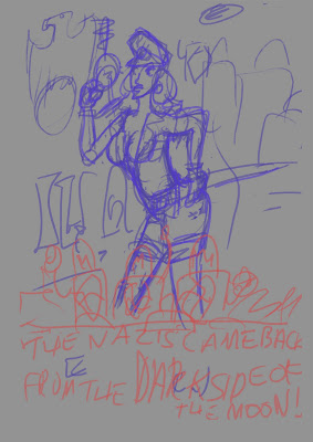
 So with a pose decided, yet another sketch was done. The original idea was to do the illustration in the form of a poster to a movie about Nazis coming from the moon on flying saucers, thus the text. However since it was going to be a magazine cover we decided to keep it all more general.
The sketch above was sent to T for inking. T's style is very angular and spiky, which I think actually suited the piece quite well.
 With the lines settled, it was time to open Photoshop and start doing the colouring. Since that process would make this blog entry too big (and blogger is a bit unwieldy to compose posts with in the first place) I'll do the inprogress for that in a second post. Keep tuned.
STOP PRESS ! Check out part 2!

 So first off, what I call the quick and dirty colours. This was all done with default Photoshop brushes on a layer over the lines set on 'Multiply'. By playing around with the different brush and opacity settings one can create an interesting texture over which to do some main colours.
 After a bit of refinement, I threw a texture over the colours, basically a layer set on 'Overlay'. The texture in this case comes from a rusted metal column the girlfriend very kindly took a photo of. If you're curious, check out the original photo here.
 Discussion with T concluded that we weren't that happy with the colours - yet. So it was time to tweak the colours; first via a bit of desaturation (through the Saturation/Hue/Lightness panel) and then the blues were increased in order to make the background 'colder' and hopefully the figure would pop out a bit more.
 Noisese is generated over the picture (through Filters - Noise - Generate Noise) to give a fine textured effect I tend to quite like. And finally, some excitng sounding (hopefully) magazine text is thrown around in wild abandon. Yes, Schlock issue 2 WILL have a story involving John Keats and a Succubus, so in no way I made that one up. So go check out Schlock for your quality reading needs, and let me know what you think!


